Categories
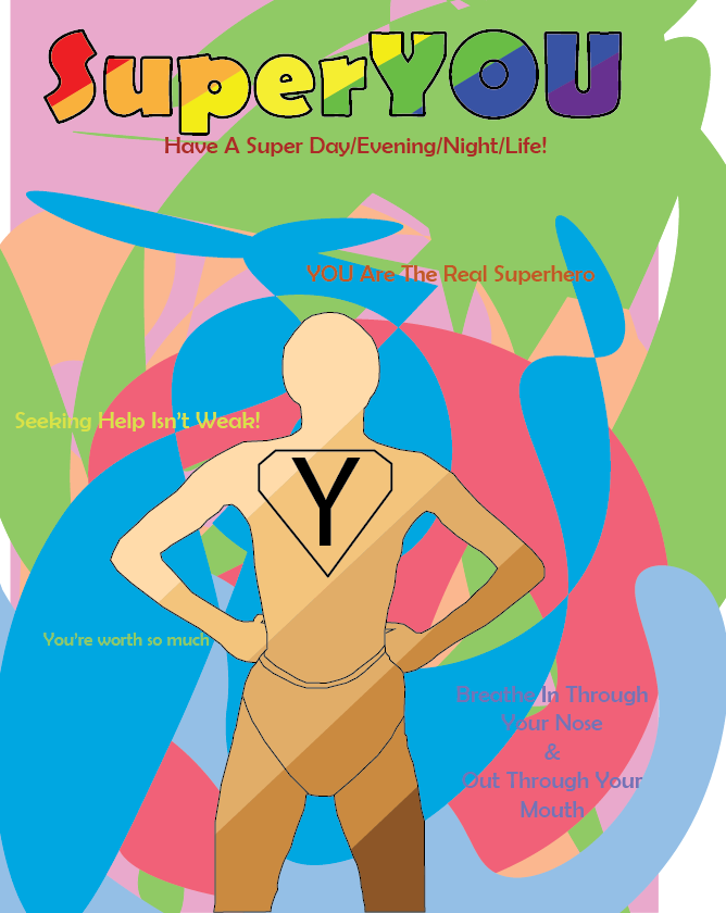
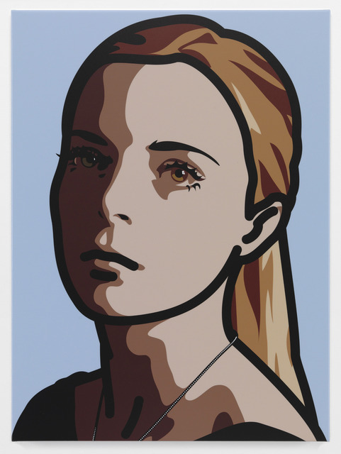
Final Poster Design
For this week’s test, I used self captured photography and Adobe Illustrator to create a draft sketch for my final poster based around my SuperYOU logo sketch.
For the base of my the figure I captured an image of myself using my phone camera on a timer. I then imported the image into Adobe Illustrator and used the pen tool to outline the image. I created the shorts from memory.
I chose the pose in the image specifically because it is an iconic superhero pose, most commonly shown being performed by Superman. I also used the sketch of the SuperYOU logo for the outline of the logo on the figure’s chest. However, I did modify the ‘Y’, instead of using the hand-drawn ‘Y’ I used the text tool and the font ‘Myriad Pro’ instead because it has a nicer look to it compared to the Y that I drew.
For my final poster design, I plan to use the curvature tool to create the background. I plan to use the PANTONE+ Solid Coated swatch like I did for my “Drawing in Adobe Illustrator” post. I have chosen to continue using the PANTONE+ swatch because it includes many variations of colours, many light variations, that are commonly associated with being able to brighten people’s moods. I also plan to use the ‘Berlin Sans FB’ font like I did in the SuperYOU sketch. I will also include the SuperYOU text like I did in the original logo sketch. I will also include different types of motivational quotes like “you can do this” “you’re a good person” but also bits of advice, from online articles and from advice I’ve received from therapists.
For this week’s task I used Adobe Photoshop and a picture I captured with my phone and combined the image with original resources to create a final piece.
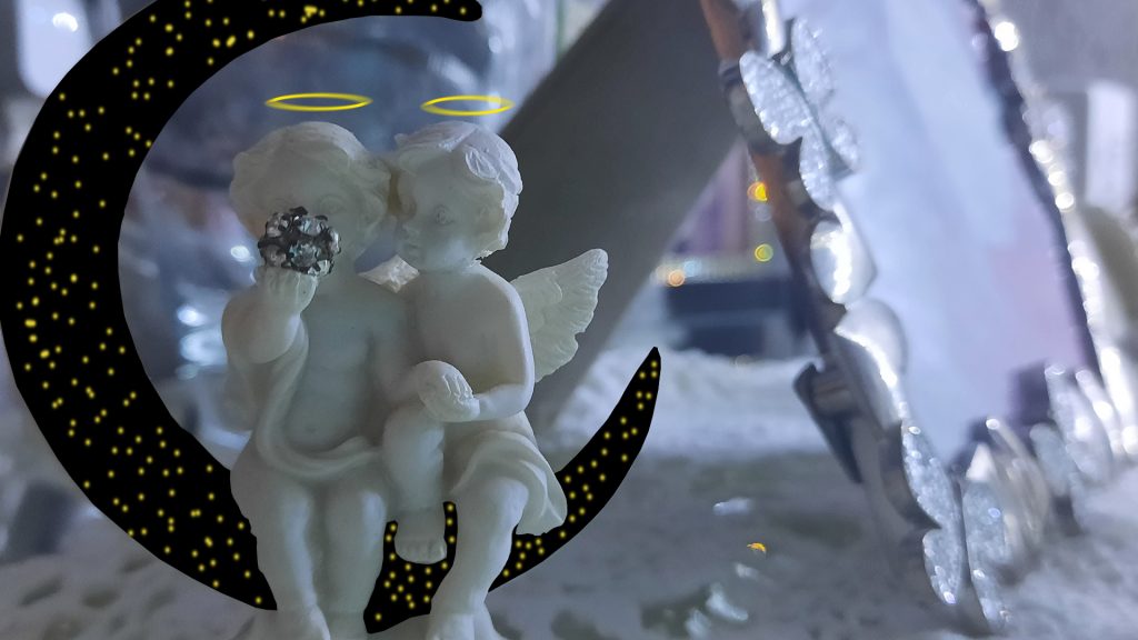

I used Adobe Photoshop to create original assets that I combined with the image of the angels ornament.
I had to rasterize (the process of converting an image into pixels so it can be edited) the original photo before I could edit it.
For the moon, I used the Polygonal Lasso Tool and manually selected points, using the moon in the original image as a guide for my points. After I had selected all the points and connected my selection, I deleted the selected area. I had to make sure the background layer was separate so that I could place the assets behind the cut out sections.
For the night sky image, I used the rectangle tool and drew a black rectangle behind the image so it occupied the space the deleted selections did. I then used the brush tool and picked a random yellow using the colour palette and then randomly spread the stars around until I was happy with the placement of all the stars. I then applied the motion blue filter to give the stars a feel that they are being viewed from far away.
For the halos, I used the ellipse tool and used the same colour I used for the stars. I drew the ellipse above the head of the angels, I then applied a motion blur filter to give the halos a more heavenly effect.
Creating this image has helped me to gather composition skills that will be useful in compiling my final poster piece.
For this week’s task, I used Adobe Illustrator to create a minimalist Julian Opie inspired drawing.
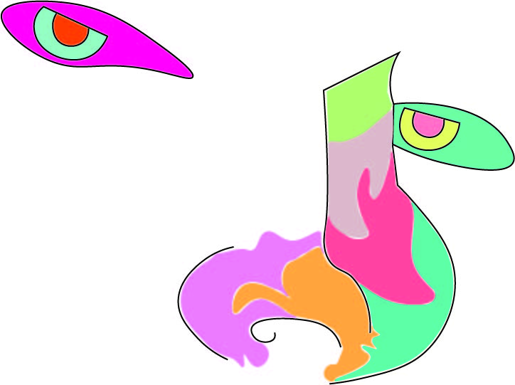
I used the curvature tool in Adobe Illustrator to create the outline around the nose and mouth, I also used the pen tool to connect the top of the nose and the top line of the eyes because I think it looked more appealing to have those lines be straight rather than curved.
I decided to use a picture of my face for the drawing because I believe it was the perfect image to test my skills and not push myself beyond my capabilities. I used my nose and eyes as guidance for the outline of the drawing and then just created random shapes and filled them with random colours.
I used the colours that I did because, as I mentioned in my previous post, I plan to use colours that are commonly associated with superheroes but also colours that are believed to increase mood.
For the colours in my drawing I mostly used the PANTONE+ Solid Coated swatch and the default Adobe CMYK swatch, but I only used one colour from the CMYK swatch. Full list of colours used below.
Nose:
PANTONE 223 C;
PANTONE 1365 C;
PANTONE 333 C;
PANTONE 709 C;
PANTONE 5035 C;
PANTONE 365 C.
Left Eye:
CMYK Magenta;
PANTONE Green 0921 C;
PANTONE Orange 021 C.
Right Eye:
PANTONE 3248 C;
PANTONE 393 C;
PANTONE 1775 C.
Julian Opie is a painter that has inspired me for a long time. His use of paints is quite similar to vector imagery because of it’s high quality, use of linework and solid colours which are all very common aspects of vector imagery.
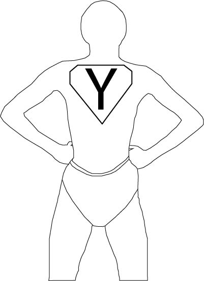
For this week’s task I used Adobe Illustrator to create a base black-and-white sketch that is based around a superhero logo.
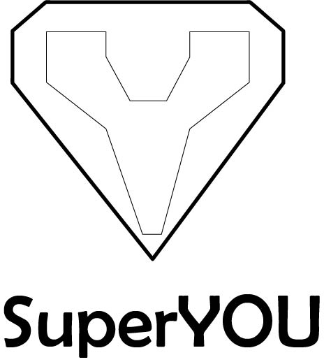
The above image is the sketch that I made. I used a diamond esc shape for the outline of the logo because it resembles the ‘Superman’ (DC) logo. Superman has one of the most recognizable logos from comics.
I attempted to further reference the ‘Superman’ logo by having a ‘Y’ shape in the sketch, the ‘Y’ referring to the person that is viewing the poster. The trope of a letter being inside of diamond shaped symbol is also very commonly noticed by a lot of people because of the fame of Superman and his logo.
The text “SuperYOU” in my sketch is also a reference to ‘Superman’ and many other superheroes that have ‘Super’ in their name. The text I used for ‘SuperYOU’ is Berlin Sans FB. I decided to use a Sans Serif font because a lot of comics/posters commonly use a Sans Serif font when the topic of the comic/poster is superheroes.
The use of ‘SuperYOU’ was purposefully done so that the poster can be directed at anyone regardless of age, sex, gender, sexuality, race etc.
To continue on from my sketch, I plan to research bright colours that are associated with superheroes and that are commonly thought as to be “mood-boosting” colours. My current ideas for colours is yellows, blues & greens because they have a lot of brighter variations.
I decided that I wanted to follow on the topic that I focused in for my final post of my Presentation Campaign Graphic, comic-book movie adaptations. I also want to include a tone of mental health in my poster.
The purpose of my poster is to use superheroes, which are commonly known to be strong, powerful figures that protect the world from evil, to empower people to believe that they are just like superheroes. I want to create a poster that helps people to feel confident in their abilities and to make them feel that they’re a good person.
The audience for my poster can be broken up into multiple groups:
Superhero Enthusiasts – people who are interested in superheroes whether that be from movies, comics, tv shows etc. I want to use the imagery of superheroes and not include any kind of lore and not require any prior advanced knowledge of the superheroes included in my poster
Mental Health Enthusiasts – people who rather suffer from some form of depressive or anxiety disorder or people who take an interest in the psychological area surrounding mental health. This target audience will also be addressed because the poster has the purpose of helping people to feel better mentally.
Children – I decided to target children with my poster because a lot of children have interest in superheroes regardless of race, sex, age etc. The purpose of the poster is also helpful because it can teach them about taking care of their own mental health and how to help other people when they are not okay.
For this weeks task, I slight moved my subject focus from just comics and towards comic book movie adaptations. I choose to shift my focus for this task because comic books have very little marketing for them in the modern age so I feel I could not form a sufficient blog post from it.
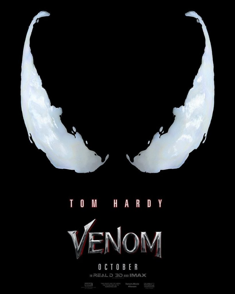
The Venom (2018) poster uses very simple, clean visuals. The simplistic design of the poster matches to the target audience because Venom is such a staple mark character in Marvel Comics.
The main design of the poster features Venom’s eyes. The use of Venom’s eyes by the designers is smart because the comics also used Venom’s eyes to indicate when he was going to be a focal point in an issue so the poster mimics the cover of a comic book by using their eyes to show that Venom is the main character in the movie.
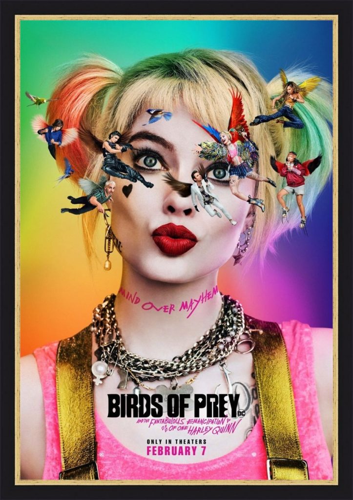
For my second analysis, I decided to use the Birds of Prey (2020) movie poster. The poster for Birds of Prey tackles the movie audience and comic audience as separate audiences, rather than treating them as the same audience, but they use the same aspect to address them, the characters.
The movie audience is addressed through the use of characters on the poster. The poster displays the characters floating around Harley’s head. The use of the characters in this way helps to portray Harley’s mental instability to the audience.
The comic audience is addressed through the use of characters on the poster as well. The classic Birds of Prey in the comics are not the same as the Birds of Prey in the movie. The classic Birds of Prey being Oracle, Huntress and Black Canary. The use of the characters on the poster helps to show that the comic audience can expect the newer Birds of Prey and the craziness that Harley Quinn carries with her.
For this task, I decided to create one of the most iconic pieces of a superheroes ensemble, their brand/logo by drawing inspiration from two of my favourite superhero logos.
The above logo is from the animated TV series ‘Batman Beyond’ (1999). I watched the show when I was a kid and it was one of the TV shows that acted as my gateway into comics.
I decided to draw inspiration from this logo because Batman is one of the most recognisable logos and the sharpness of the logo is very pleasing to me. My other favourite batman logos (The Arkham Game Series and The Dark Knight Series) also heavily resemble the Batman Beyond logo.
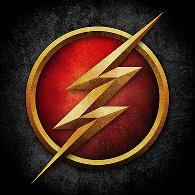
The second logo I drew inspiration from The Flash (2014) TV Show. The logo itself draws inspiration from the Barry Allen era Flash logo.
I personally like the logo because of its metallic look. The sharp points of the Flash symbol also play well with the sharpness of the Batman Beyond logo.
This is my final piece. I used the pen tool for the outlines of the pieces. You can see where the inspiration from the Batman Beyond and The Flash logos. I added a drop shadow to both layers of the logo to add a sense of depth to the logo and helps it to feel like it is protruding out of a costume.
I used ‘OCR A Extended’ for the text and the text is a copy of my work from last week. I used a gradient on the text to match with the drop shadow on the logo. I also used the PANTONE Solid Coated palette for both shades of green. I decided to use a gradient for the text instead of a drop shadow to make it seem like it was more like a title for the work rather than part of the logo itself.
For this task, I decided to narrow down my choice to comics because that is what I am more interested in.
For this weeks task, I decided to use a page from one of Frank Miller’s Batman comics that I found online. I wanted to use this image because it helps to portray a common use of blue in comics to represent cities and one of my favourite parts of writing is creating bustling cities.
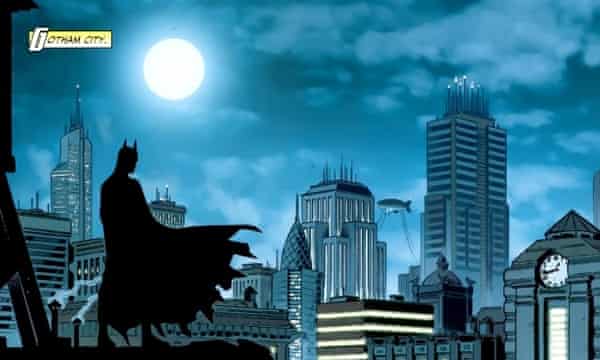
In my first image I used ‘OCR A Extended’ because it has a very technological design to it with it’s ridged edges and blocky feel. I used the eye dropper tool in Illustrator to get samples of the blues so that I could use the text to represent the city. It gets brighter as the text moves towards the I because I used the I to represent the moon and how the moon is the only pure source of light in these cities and everything else is lit artificially, be that from streetlights, buildings or cars.
In my second image, I did not change a lot besides from changing the C to a much darker colour. This is to reflect how a lot of comic book artists, like Frank Miller, will use darker and harsher colours to break the characters away from the city so that the characters are the focal point and to stop them from just blending into the scenery.
Overall, I believe I captured the essence of comic books and Frank Miller’s style of comic book art, quite well in my text.
I mentioned in a former post that I decided to use ‘OCR A Extended’ because it has a Neo-Dystopian feel to it. I believe that the Neo-Dystopian effect of the text also applies in the post because the Batman comics are quite regularly set in a Neo-Dystopian Gotham City.
I decided that I wanted to create two simple logos. I decided on two because of my influences being closely related to one another.
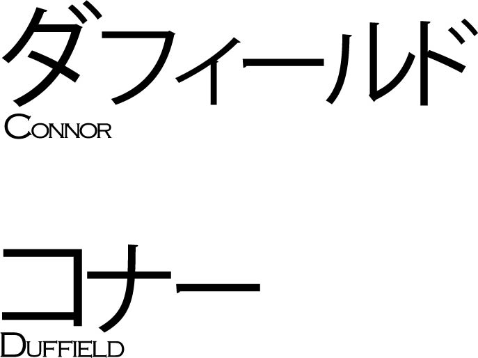
I decided to format my first piece in the way that I did because it matches to a lot of ‘Slice of Life’ anime. Slice of Life is a genre of anime that closely mimics real life, so there are no superpowers or unrealistic plots. (Lucky Star is an example of a Slice of Life anime).
Adobe Illustrator does not have a native inclusion of Japenese symbols (Kanji, Hiragana and Katakana) so I used Google Translate. I just typed my name into Google Translate and then checked it against an online Japenese dictionary to make sure it was accurate and then pasted it into Illustrator and formatted it.
For my second piece, I used OCR A Extended because it gives me a technological feel and neo-dystopian comics are one of my favourite genres of comic and a convention of that genre is technology.
The sharp corners and more blocky curves are what gave me the confidence to use OCR A Extended because it follows the dystopian conventions.
The inspiration to follow the path of formatting my name in a Neo-Dystopian style comes from the Tron comics.
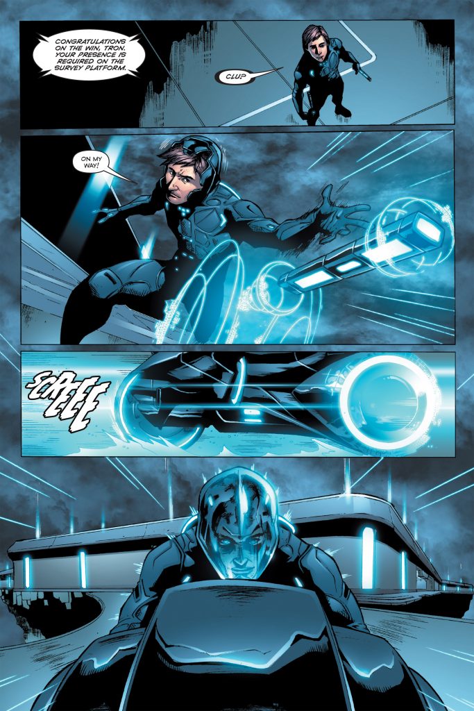
Throughout the different issues of the TRON comics, the architecture takes on a Neo-Dystopian style. The Neo-Dystopian style is characterized by a lot of neon lights, sharp corners, glossy materials and normally is related to a part collapse in society to which the architecture acts as a contradiction because the buildings normally look sleek and clean.
I tried to capture the Neo-Dystopian style by using TRON as an example when formatting my text..